library(tidyverse) #loading in initial packages necessary for visualizations
library(janitor)
library(grid)
library(ggridges) # loading in package for ridge plot
library(dplyr)
library(readr)
library(heatmaply) # loading in package for heat map
library(showtext)
library(sysfonts)
library(wesanderson) # wes anderson based color palette
library(ggrugby) # loading in ggrugby package for field shape
library(here)
showtext.auto() # making sure fonts show up in doc

my_data <- read_csv("/Users/leahpettway/ENVS-193DS/github/Rugby-Affective-Visualization/data/Personal_data.csv") # loading in personal data Rugby Affective Visualization
Initial Set-up
Cleaning Data
set.seed(123) # ensuring the same output of numbers occurs each time the code is ran.

# Clean data and create formation
my_data_pitch <- my_data |>
  clean_names() |> # cleaning names so they are all lowercase and remove spaces
  drop_na() |> # dropping any n/a values in the data
  mutate(
    # spread players across pitch width
    width_position = seq(5, 65, length.out = n()),

    # formation positions
    x_position = ifelse(
      rugby_practice_day_yes_or_no == "yes",
      # attacking backline behind right 10m line
      58 + 8 * sin(width_position / 10),

      # defensive line behind left 10m line
      42
    ),
    y_position = width_position
  )
my_data_clean <- my_data |> # create clean data object for other visualizations
  clean_names() |> # cleaning names so they are all lowercase and remove spaces
  drop_na() # dropping n/a values from the data set
1. Rugby Pitch scatterplot
font_add_google("Playfair Display", "wesfont") # choosing a font that follows a wes anderson theme
showtext_auto()

line_arrows <- data.frame( #creating positional lines to denote the different lines
  x = c(75, 20),        # where the arrow starts (pointing at the line)
  y = c(55, 35),
  xend = c(55, 35),     # where the arrow points
  yend = c(40, 30),
  label = c("Attack Line", "Defense Line")  # text to display
)
plot1 <- ggplot() + # base plot
  rugby_pitch() + # rugby field to put points onto
  geom_point(
    data = my_data_pitch, # wrangled data for field plot
    aes(
      x = x_position, # x- axis
      y = y_position, # y - axis
      size = amount_of_protein_grams, # make the point size reflect the protein amount
      color = rugby_practice_day_yes_or_no # delineate each category by color
    ),
    alpha = 0.85,
    shape = 4,
    stroke = 0.8
  ) +  # Arrows pointing at attack and defense lines
  geom_curve(
    data = line_arrows, # arrow position data frame
    aes(x = x, y = y, xend = xend, yend = yend), # set position to the points
    curvature = 0.2, # how much arrow curves
    arrow = arrow(length = unit(0.03, "npc")), # give the arrow an arrow head
    color = "#2E4053",
    size = 0.8
  ) + # Labels for attack/defense lines
   geom_text(
    data = line_arrows,
    aes(x = x, y = y, label = label),
    family = "wesfont", # make sure font is still in theme
    color = "#2E4053",
    size = 5,
    fontface = "bold",
    nudge_x = -2,
    nudge_y = 2
  ) + # Color and size scales for protein points
  scale_color_manual(values = c("yes" = "#8B0000", "no" = "#404472")) + # muted darker colors for rugby or no rugby days
  scale_size(range = c(3, 8)) +
  scale_x_continuous(expand = expansion(mult = 0.05)) + # make spacing adjust to window
  scale_y_continuous(expand = expansion(mult = 0.05)) +
  coord_fixed() + # Titles and labels
  labs(
    title = "Protein Intake on Rugby vs Non-Rugby Days",
    color = "Practice Day",
    size = "Protein Intake (g)"
  ) + # Wes Anderson theme
  theme_void(base_family = "wesfont") +
  theme(
    plot.title = element_text(face = "bold", size = 20, color = "#2E4053"), # plot aesthetics
    plot.subtitle = element_text(face = "italic", size = 14, color = "#566573"),
    legend.title = element_text(size = 12),
    legend.text = element_text(size = 10),
  )
Warning in ggplot2::annotate(geom = "segment", x = c(spec$origin_x,
spec$origin_x + : Ignoring unknown parameters: `fill`Warning in ggplot2::annotate(geom = "segment", x = c(spec$length -
spec$origin_x, : Ignoring unknown parameters: `fill`Warning: Using `size` aesthetic for lines was deprecated in ggplot2 3.4.0.
ℹ Please use `linewidth` instead.print(plot1)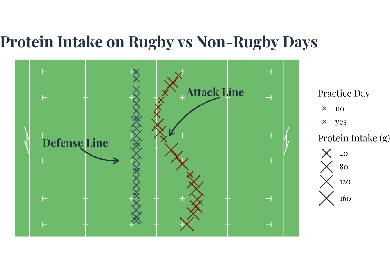
ggsave("Scatterplot.jpeg", plot = plot1, width = 6, height = 4, units = "in")2. Creating a correlation heatmap
# Font
font_add_google("Playfair Display", "wesfont") # use same font as previous visualization

# Wes Anderson palette
wes_colors <- wes_palette("AsteroidCity1", 3) # put into form that is ready to use in heatmaply
wes_gradient <- colorRampPalette(wes_colors)(100)

heat_data <- my_data_clean |>  # clean up data for correlation map and choose numeric variables
  select( # variables of interest
    amount_of_protein_grams,
    total_caloric_count_of_protein,
    caffeine_intake_milligrams,
    number_of_calories_burned_calories
  ) |>
  rename(
    "Protein (g)" = amount_of_protein_grams, # change labels
    "Protein Calories" = total_caloric_count_of_protein,
    "Caffeine (mg)" = caffeine_intake_milligrams,
    "Calories Burned" = number_of_calories_burned_calories
  )

# Correlation matrix
matrix <- cor(heat_data, use = "complete.obs")

heatmaply( # using correlation matrix for the heat map
  matrix,
  colors = wes_gradient,
  dendrogram = "none",
  xlab = "Variables", # labeling x axis
  ylab = "Variables", # labeling y axis
  main = "Correlation Heatmap of Personal Nutrition & Activity Data", # title
  scale = "none",
  margins = c(80, 200, 50, 20),  # pushes y labels left
  hide_colorbar = FALSE, # changing the heat map aesthetics
  grid_color = "white",
  fontsize_row = 12,
  fontsize_col = 12,
  cellnote = round(matrix,2),
  notecex = 1
) |>
layout(
  font = list(family = "Playfair Display"), # edit the spacing and font
  yaxis = list(
    title = list(
      text = "Variables", # test I want moved
      standoff = 10   # pushes title away from labels
    )
  )
)
3. Creating a ridge line plot
font_add_google("Playfair Display", "wesfont") # using same font throughout for theme

wes_colors <- c("yes" = "#8B0000",  # show category by color
                "no"  = "#404472")

plot3 <- ggplot(my_data_clean, # base plot
       aes(x = amount_of_protein_grams, # x axis
           y = rugby_practice_day_yes_or_no, # y axis
           fill = rugby_practice_day_yes_or_no)) + # choose color based on rugby or non rugby day

  geom_density_ridges(alpha = 0.7, scale = 1.2, color = "#2E4053", size = 0.3) +
  # look of ridges
  scale_fill_manual(values = wes_colors) + # color of ridges

  labs( # labels
    x = "Protein Intake (g)",
    y = "Rugby Practice Day",
    title = "Distribution of Protein Intake on Rugby vs Non-Rugby Days"
  ) +

  theme_ridges(font_family = "wesfont") +  # sets font for the plot
  theme( # plot aesthetics
    plot.title = element_text(face = "bold", size = 18, color = "#2E4053", hjust = 0.5),
    axis.title = element_text(size = 12, face = "bold"),
    axis.text = element_text(size = 10, color = "#566573"),
    legend.position = "none"
  )
print(plot3)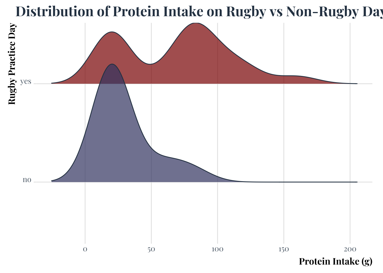
ggsave("ridgeplot.jpeg", plot = plot3, width = 6, height = 4, units = "in")Picking joint bandwidth of 15.1E. Write up
The patterns I am highlighting in the visualizations is the difference in the amount of protein I am ingesting on rugby versus non rugby days since ultimately the highest intakes occur on rugby days, but lower amounts are more consistently achieved over non rugby days. This is also shown in the ridge line plot with the higher peak of the non rugby days curve but at a lower protein intake. The correlation Heat map shows the habits that may contribute to those outcomes like the negative correlation outcome of ingesting caffeine and eating protein.
The aesthetic choices were mainly driven by finding the Wes Anderson palette for r. I chose many muted colors and much more prim looking font to continue the attempt at a more Wes Anderson aesthetic. I find that it also resembles a playbook which is a fun way to display the sport focused nature of my personal data. The examples I drew from are the plays and shapes made during rugby practice by my coach Kelly Griffin. I also took inspiration from rugby fields themselves or a pitch. Heat map correlation was pulled from the r gallery by Yan Holtz and Wes Anderson palette created by Karthik Ram. I liked the mosaic look to the correlation graphs as well. The ridge line plot was also inspired by the r graph gallery ridge lin.
In the process of coding the visualizations I had to clean up the data in the form of creating positioning for my observations in the shapes I wanted so finding a mode that would work to create the formations I was imagining. I started with normal points for my scatter plot and went on to keep that for the final rendering of the plot. I started with a ggcorr plot but then I changed ot heatmaply sine it displayed correlation in a more visually capturing way also I had to make sure the variables were numeric to properly run the heat map. The ridge line was fairly straightforward .
I used google, other peoples code, and reddit. In using google I would look up hex codes, errors, and potential sport packages to use for the visualizations. In using other peoples code I used i took the listed code from the r gallery to build the skeleton for my plots and further used the ggrugby package to create a pitch shape. Reddit was used for more hyper specific issues of moving labels and creating the aesthetic framework of the plots.